
Check out the video below if reading bores you :)
Observation is Key
Observation: It’s one of those things you just have to learn if your planning on being an artist. Whether you realize it or not, our brains are constantly processing information and evaluating whether is is correct or not. It’s some pretty amazing stuff until your non-artistic friend comes up and politely reminds you that “there’s something off” about your drawing or painting. Typically, they can’t put words to it but their brain is telling them something just isn’t right. 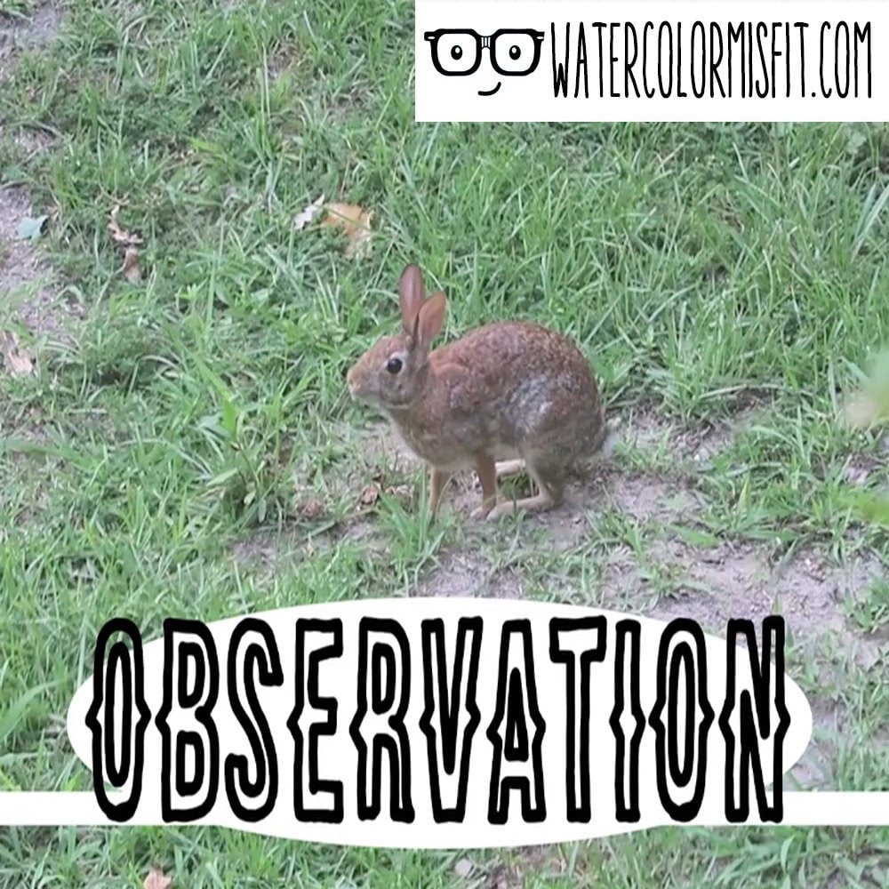
This is why observation is an artist’s greatest tool. As an artist, our brains were uniquely created to pick up on small details. Sometimes, we too can’t explain why our drawing is “off.” But with some thought and observation we can typically figure it out.
So, what does this have to do with shading…Well everything. Shading is one of those art concepts that is solely reliant on observation. Basically, shading can change based on your perspective, your light source, and something most don’t think about the object itself. So today, I’m going to be teaching you 4 ways on how how to train your brain to observe the key elements that I use for shading.
But before I get into those, let’s briefly talk about shading in general.
Methods of Shading:
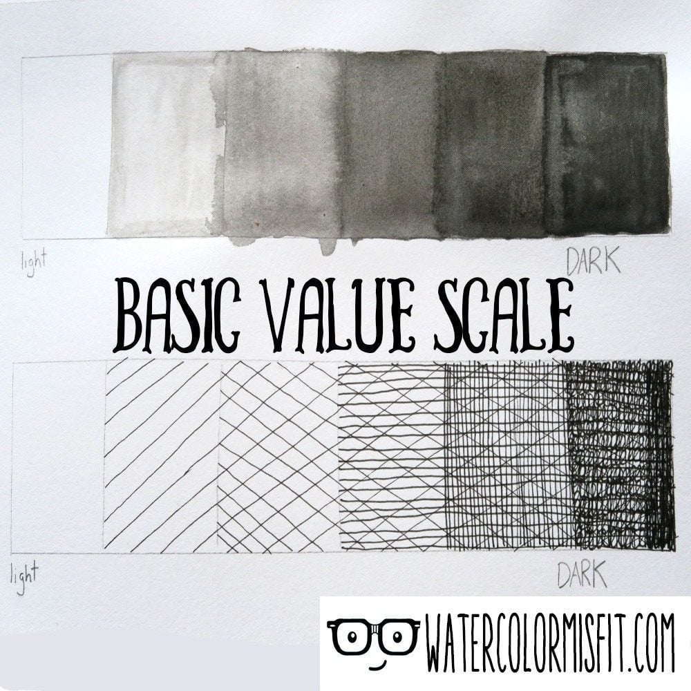
There are two main methods, which I use for shading Smooth/Gradual Value and Cross Hatching.
Smooth/Gradual Value: Basically is a smooth transition from dark to light. You most likely have seen this before. I prefer this method when I’m trying to communicate smooth surfaces (such as metal or even a balloon.)
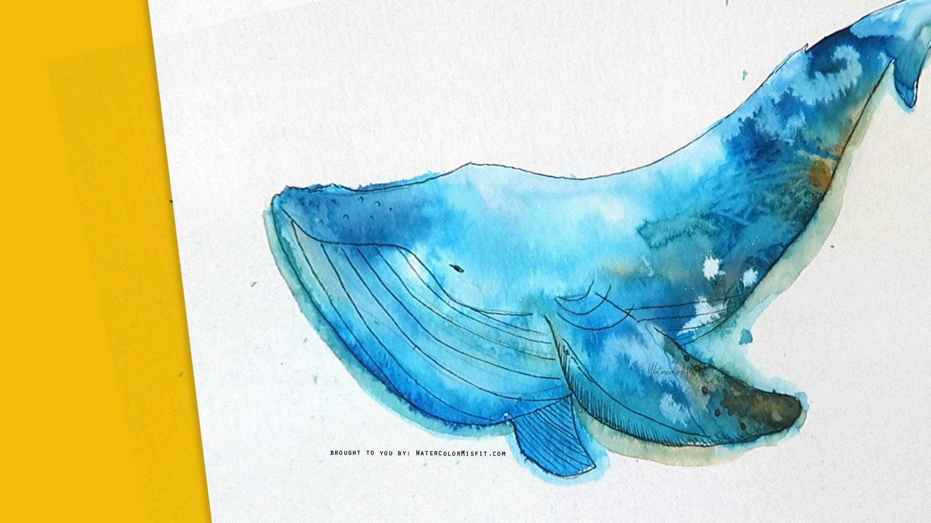
Cross Hatching Value: This method is not as well known, but I see it gaining more popularity in recent years. Basically with this method, you are using lines in random or uniforms ways to convey value (or shading). I prefer this method when I’m trying to communicate texture (such as on a flower petal)
And here it is, 4 tips on shading based on my observations…
1) Light-Source:
The first aspect we need to think about is our light-source. Ask yourself these questions…
-How many light sources are there?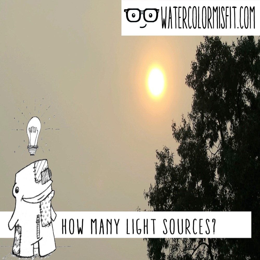
-typically you will only have one for a drawing or painting, but sometimes you can have two or even three such as if your trying to draw a still life. So keep that in mind.
– I’m going to concentrate on just using one light source today with shading.
The next question to ask yourself…
-Is the light source harsh (or extremely bright)
-If it is bright, your shadows will have sharp lines which are very dark compared to your light source.
-is the light source soft
-If so, your shadows will be less intense and have a gradual dull gray appearance.
2) Don’t Just Think Shape:
You’ve most likely seen the basic shading tutorials on circles, triangles, squares, etc. These are pretty straightforward and easy to learn. The problem is when you try and jump from a basic shape to a realistic flower, pet, or person. Suddenly, you feel lost. Once again, Observation is KEY.
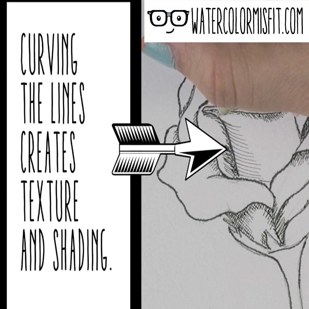
-Think about Texture
-Everything we touch has some form of texture. Even the delicate flower petal as tiny veins which swoop around the flower in intricate detail. Remember that shadows help us communicate these textures to the viewer. I love to use crosshatching for this reason. It’s a simple way of training your brain to see texture and apply it into your drawing. (An example of this is shown below). Here I placed swooping round lines to communicate the curvature of the petal. I’m also communicating how the light is flowing around the object. So just something to keep in mind.
-Think Dips and Valleys
–This brings us to our next question, where are the “dips” or “valleys” on my object. Sometimes I like to think of myself as an ant crawling over my object. Crazy I know, but it works for me. Let’s say I was an ant on a flower pedal. Where would the petal fold or bend in on itself? How deep is the fold? All these questions are crucial for me to understand how dark and how sharp my shadow should appear. 
3) Overlapping
So, now your drawing/painting is starting to come to life. However, there is still one more aspect we need to consider.
-Is there anything “hanging” over my object?
-If there is, then it will cast a shadow.
-The next question to ask ourselves is “How high is this item overlapping?”
-Depending on the height, this will communicate once again, how sharp and how dark to create my shadow.
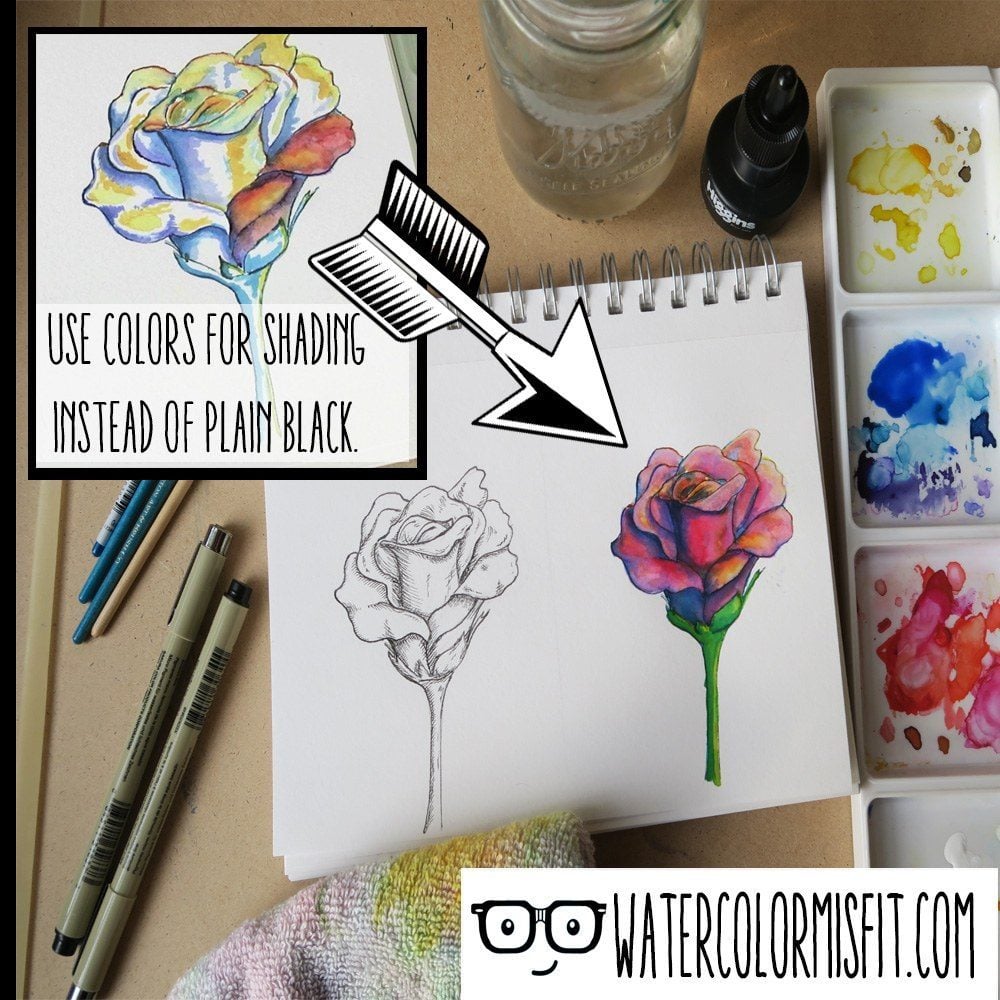
4) Don’t be Restricted by Color:
As an artist, don’t limit yourself to the norm. Think outside the box and take chances. When your thinking about shading, don’t just think about gray scales. In real life, very rarely are shadows truly gray or black. Remember that color hue can also communicate value (or shading).
-For example: let’s say you are painting a brilliant red rose, instead of using black to tone down your red for the shadows, consider using a blue or purple.
-Also don’t fall into the trap of only thinking about the shadows when you are shading. Consider your lightest tone (or your highlights). Light creams or yellows are great for communicating the warmth from your light source.
And that’s it! The four “tricks” I use for shading. If you like these ‘tricks’ please make sure to like and subscribe. If you have a trick for shading that I didn’t mention, please make sure to comment below. As always guys, it’s been a blast and keep shining out your awesome skills.


2 Comments
Jacquie ann Williams
October 14, 2017 at 8:19 pmAges since art college this was a refreshing reminder.very good teaching thanks
Patty
August 23, 2023 at 1:42 pmAwesome!! Thanks.