

I’m extremely picky when it comes to my watercolor paints. I don’t really care about the brand – but rather the overall feel and look of the paint on the page. I love colors that a bright and smooth in appearance (meaning very little to no granulation). I also love colors that mingle or merge easily with one another especially in wet on wet situations.
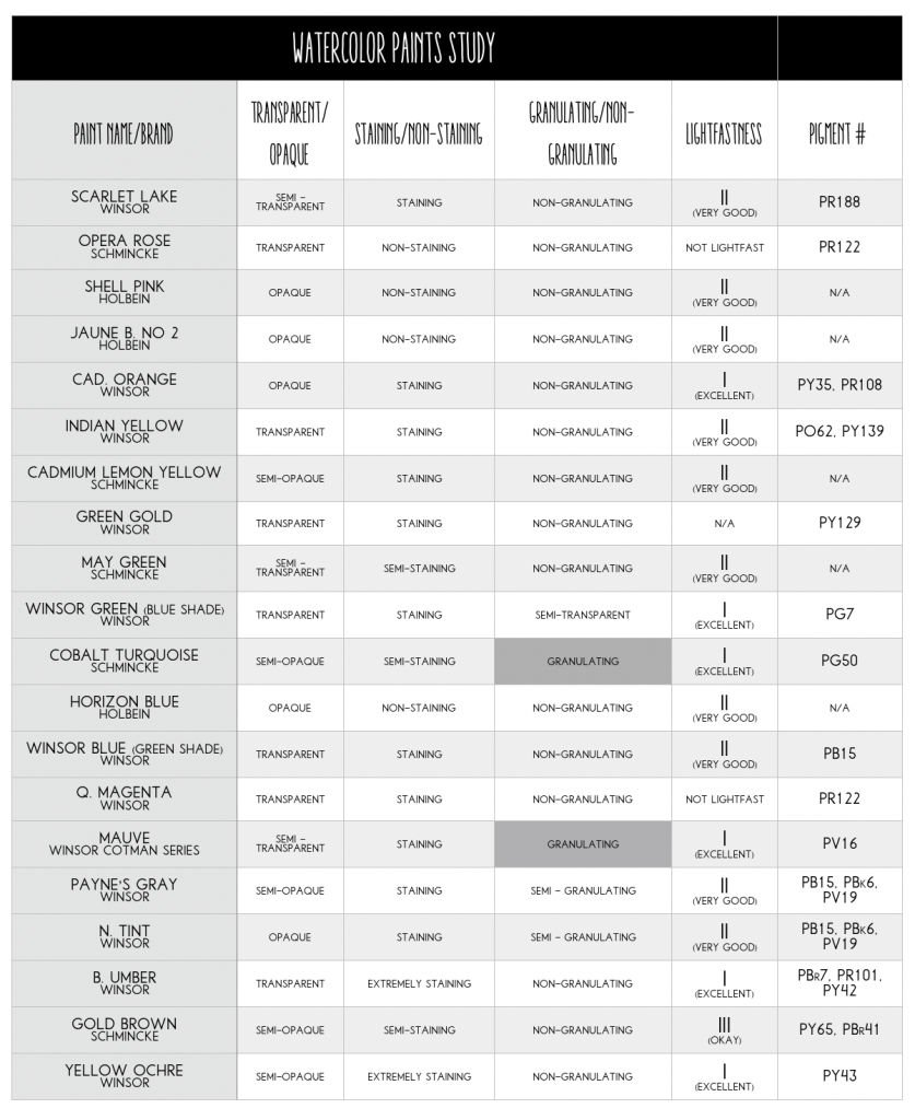
So below is a list of my favorite paints as well as the brands that I use on a daily basis. Since I’m a nerd when it comes to my paints – I’ve also included my paint resource chart – laying out the make-up of each of my paints below.
Note: I do earn a small bit of affiliate commissions from the Amazon links below (as folks have asked me to provide them with the links), but these are all paints I have tested and use. Thanks.
SO HERE ARE MY FAVORITE WATERCOLORS
1. BRILLIANT OPERA ROSE – SCHMINCKE
2. SHELL PINK – HOLBEIN
3. SCARLET LAKE – WINSOR
4. CADMIUM ORANGE – WINSOR
5. INDIAN YELLOW – WINSOR
6. JUANE BRILLIANT NO.2 – HOLBEIN
7. CADMIUM YELLOW – WINSOR
8. CADMIUM YELLOW LEMON – SCHMINCKE
9. GREEN GOLD – WINSOR
10. MAY GREEN – SCHMINCKE
11. WINSOR GREEN (BLUE SHADE) – WINSOR
12. COBALT TURQUOISE – SCHMINCKE
13. HORIZON BLUE – HOLBEIN
14. WINSOR BLUE (GREEN SHADE) – WINSOR
15. QUINACRIDONE MAGENTA – WINSOR
16. MAUVE – WINSOR COTMAN SERIES
17. YELLOW OCHRE – WINSOR
18. GOLD BROWN – SCHMINCKE
19. BURNT UMBER – WINSOR
20. PAYNE’S GRAY – WINSOR
21. NEUTRAL TINT – WINSOR
OTHER PAINTS I’M TESTING
So those are the MAIN colors but I’m also testing a couple of new watercolor paints. personally, I’m not a huge fan of pan paints when it comes to watercolor – but these paints caught my eye. They aren’t considered traditional watercolors – but their color pay off is really good for an inexpensive pan paint. But I will say – some of their blues and greens aren’t that great. So you may want to substitute some tube paints for the colors that don’t have as great of a color pay off. ?
Kuretake Gansai Tambi Watercolors, 48 Colors
OTHER INFO ABOUT MY MAIN PALETTE
If you are nerd like me – you like to know everything about your paints. So here’s a little list that I put together on some basic info on my paint colors and their make-up. :)


19 Comments
Cindy R
June 7, 2018 at 4:52 pmAlways like to know what your favorites are. Just starting out and so limited resources, so I can really appreciate knowing what you have found with the supplies. Please do more of these videos. And really enjoy the tis. They help so much.
Julie
June 9, 2018 at 10:40 amBrushes are a mystery to me. There are so many different qualities and types. Some say always use a big brush and some say always use a small brush!
Maureen Andersen
June 12, 2018 at 10:42 pmI recently purchased one of the Daniel Smith dot cards and fell in love with ALL of the quinacridone colours. They all have the brightness and vividness that makes watercolour so compelling. Have you tried them? I am certain that they would fit well into your colour scheme!
Misfit
June 13, 2018 at 8:52 pmYeah I’ve tried Daniel Smith :) they’re great!
Jayne Kuchcinski
October 24, 2018 at 9:54 pmThanks for this valuable information on your pastel pallete Carrie, I have most of them so now will be on Amazon for a few others tomorrow.
Your the best ?
Annelouise
October 25, 2018 at 6:41 amGreat article, Carrie! I have several of your favourite colours already, but mostly in Schmincke, Sennelier and Holbein rather than Winsor and Newton. I was going to buy W and N Opera, but will now check out the Schmincke version first. And thank you for reminding me about Holbein’s Shell Pink! I was about to use a very watered down crimson for some soft pink tulips I’m painting, but the Shell Pink is actually near-perfect! :-) Anne in Oz.
Peggy
October 27, 2018 at 3:41 pmWhat a great post. So useful. I was just bemoaning a very dull looking pink in my palette last night. Thanks so much.
Radhika
October 29, 2018 at 9:30 amHi Carrie,
Thanks so much for compiling this for us. I love pastel palettes and this is such a wealth of valuable information!!
Just a quick question. For the single-pigment paints you listed above, would using a corresponding paint (with the same pigment) in another brand look similar in terms of vibrancy and hue? I wish I could use W&N and Schmincke, however as they are not vegan, I can only stick to Daniel Smith or Holbein for now. Really looking forward to hearing your thoughts on this one. Thanks again!
Jane
October 31, 2018 at 12:08 amGreat information! Thank you for sharing!
Michelle Cook
November 28, 2018 at 8:26 amHi Carrie,
I have been trying to find a good true red watercolor paint. Most that I have tried are a bit too orange for what I want, or the truer reds seem to get grainy and break apart easily. I guess I am looking for a more Christmas red. Do you have any in mind that you like?
All of the paints that you have suggested that I have tried have been lovely.
Misfit
December 3, 2018 at 11:12 pmI really love my scarlet lake red from Winsor and Newton. I see it as a more true bright red. It’s not grainy at all either. So hope that helps. That is the only red I own and for the same reasons you suggested :D
skott wyze
November 29, 2018 at 11:39 pmHi Misfit! I love your palette! Unfortunately, the amazon links are all broken so I cannot tell if they were the professional or student grades of the colors. Any help you could provide would be super useful.
Love your art style. Cheers!
Misfit
December 3, 2018 at 11:16 pmThanks for letting me know – recently the website has been doing some wonky things. I think it’s a bit overloaded with views. I’ve noticed alot more traffic to the site recently – so gonna need to check on that. As for the metal palette – I just checked and it seems the seller is actually out of the supply. I’ll need to do some digging and find another brand that is similar to the one I own.
Kendra
January 24, 2019 at 5:44 pmDid you paint your artist tote board white with acrylic paint?
Misfit
January 27, 2019 at 6:23 pmIt’s actually Rustoleum White Chalk Paint. I find that it drys matte and isn’t sticky to paint over – due to the chalky nature of the paint :)
Cristiane
April 16, 2019 at 9:07 pmHello Carrie, have you ever tried sennelier watercolors? I live in France and they are a great brand for what I understood, but I find very little material about them. I would love a review if you ever try them, with the comparison with winsor and Newton. Thanks and I love your channel!
Isabel
December 11, 2019 at 12:48 amHi Carrie,
It seems like we have many colours/Makers in common Carrie. The first one to come up was Opera Rose which I just love, and then after that many more were the same.
I would like to wish you and your family a very Happy Christmas and a Healthy and Happy 2020. Sadly Carrie my darling husband William passed away two months ago and I miss him so much. I have a wonderful family including wonderful Grandsons who are always on the phone making sure I am ok and they come over to visit and ask if I need any help,My daughter and husband have been amazing and I do not know what I would have done without any of them. My family have asked me to spend Christmas with them but I really just want to be by myself on the day with my beautiful Labrador /Retriever GALEN, a bottle of very good French Champagne and would you believe a packet (large) of really good Potato Chips Plain and Lightly Salted. We have a few really nice brands over here but I do not know if you will know them so I will not put them on here. My friends all say to me “Wow! that sounds so good I think that is what I would like to do as well!!!! “ My beautiful boy Galen is just wonderful and the best therapy and companion I could have. He has been trained as a Pets as Therapy and Companion Dog so I am very lucky to have him. I wish all your lovely students and followers all the Best as well. Sincerely Isabel
Pam
February 3, 2020 at 12:02 amIsabel I too lost my dad, 96 yrs, on Dec 16, 2019. I hope you and your dog will be together a long time, and that you will start to see your husband in a different way. Not gone just with you in a new way. Oh and watercolor really helps too ! Love Pam
Alessandra
June 10, 2020 at 5:05 pmHi Carrie! I am trying to start with just the CYM colors to learn to mix all the colors before investing in more colors, and I learned from Yasmina on SkillShare about the CYM color wheel and how to get any color from just those 3 colors.
Because many artist insist on the the traditional color wheel, it’s hard to find information on which paints are the closest to true Magenta and Cyan.
I was excited to see you provided that info, but Winsor and Newton seems to be more affordable than SCHMINCKE. Do you think you can tell me which color on W&N would be great for Magenta and Cyan?