
 How to Create the Illusion of Depth in Art
There is nothing more satisfying than finishing a painting and feeling like it communicates everything you wished it would. Sure there is always room for improvement – but that feeling of accomplishment is unlike any other. Similar to any activity time, practice, and especially ALOT of planning goes into a finished piece – especially anything involving a landscape. There are no fudging details and plenty of room for mishaps. This past week felt like a marathon – I planned, plotted, and even tried to evaluate what to do if things went south and mishaps happened during the process. So today – I’m going to be sharing with you some of the background to my secrets of a completed painting using depth.
STEP #1: COMPOSITION IS KEY
When looking through your sketchbook for drawings to paint – if your desire is to create depth in a painting – make sure to choose a sketch that has foreground, mid-ground, and background. This is where those thumbnail sketches make all the difference. I like to do thumbnail sketches of backgrounds first and then add my animal or subject of interest to them later. By framing up my subject in this case a fox – with a background that has these three elements it will be easier for me to communicate depth and interest in my painting. This particular painting that you see before you – went through FOUR rough draft drawings before the finished product. Constantly tweaking your drawing and getting the composition just right will make your life SOOO much easier when painting later on.

STEP #2: WORK OFF A VALUE SKETCH
THIS STEP IS IN MY OPINION THE MOST CRUCIAL! In essence, play around with your drawing using only one color – creating a value system from dark to light for your drawing. Basically – it’s a glorified shading chart – which we worked on in the last video – link below. What’s great about value sketches is that they are a quick way to evaluate what might be slightly off in a drawing or composition. Since we are only working with one color – this forces us to pay attention to composition as a whole for your lights and darks. Also – here’s a quick tip for you chances are if you don’t like your value sketch – you won’t be happy with your finished product. The supplies that I used for the shading chart were Faber-Castell Pitt Artist Soft Brush Pens, Set of 6, and Shades of Grey. However, I will say toward the end I switched to Winsor and Newton BrushMarker (cool grey) – which I enjoyed much more. Also, as an added side note – sometimes I do my value sketches on my computer in PhotoShop. I LOVE this option better simply because of the undo button :D – but I know not everyone can afford this – so I wanted to include the traditional way here for all of you :) Both work just fine :)
STEP #3: PLAN OUT YOUR HIGHLIGHTS
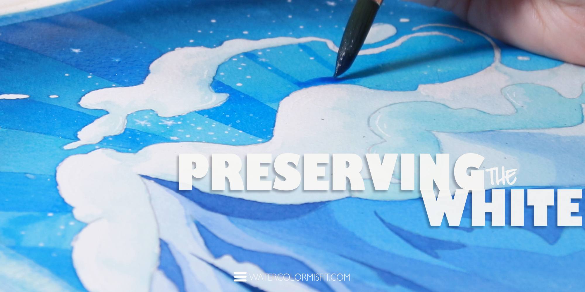
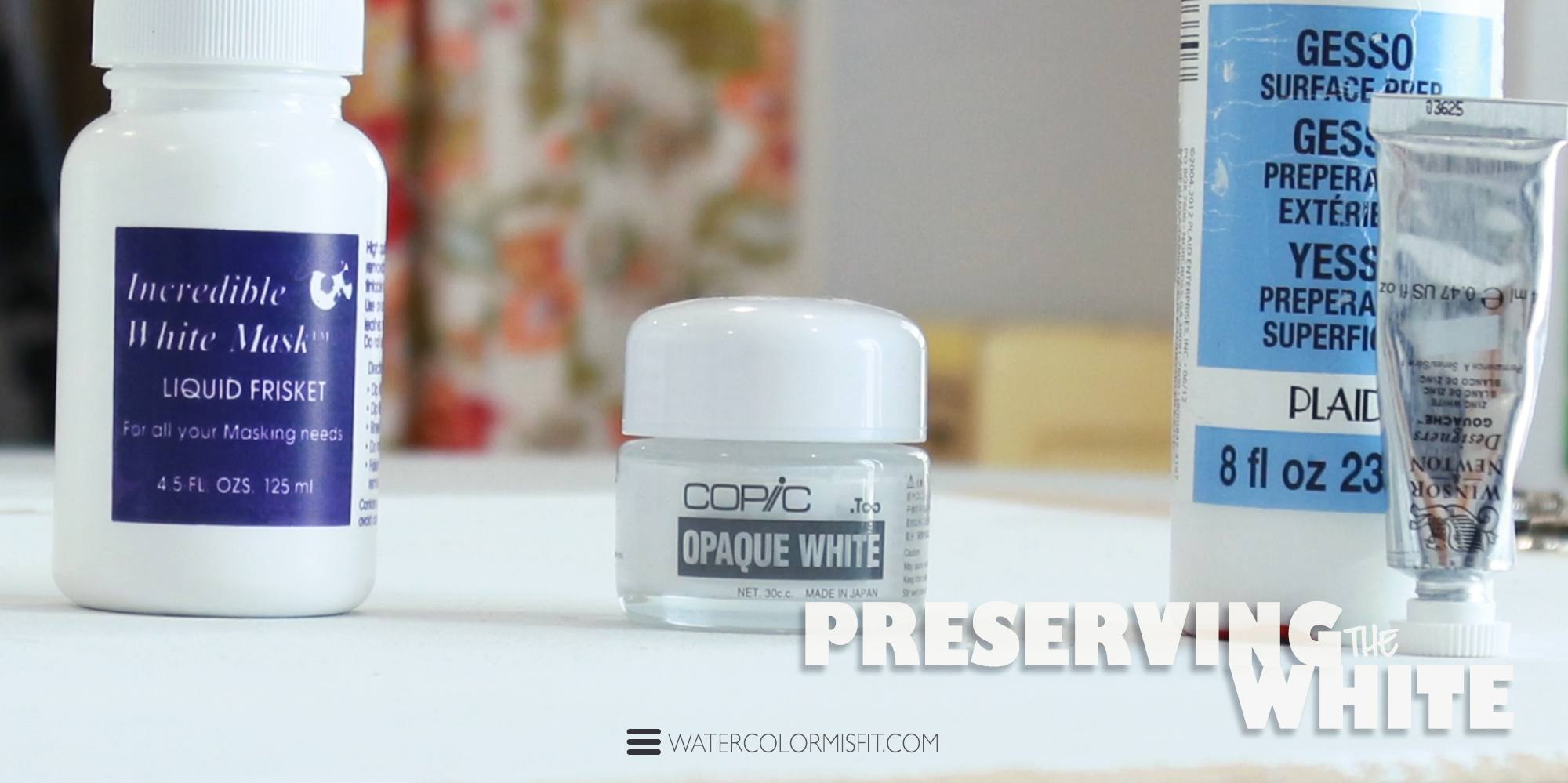
Now that you have a value sketch done – it should be pretty easy to determine areas in which you would like to preserve the white of the page and develop a plan for how one could do this. There are 3 ways to save highlights in a painting – negative space, masking fluid, or some form of opaque paint (such as white ink or acrylic paint). I used ALL 3 methods in this painting! Each one has its strong points – which I capitalized on. BELOW IS A BULLETED LIST OF HOW I USED THEM…
- MASKING FLUID: I use Grafix White Mask Liquid Frisket, 2-Ounce. This in my opinion is the best masking fluid I’ve come across. However, it can be a bit tricky to use without a special Original Incredible Nib (basically a pointy device that helps you smooth out the frisket). I used this to save the purest white of my clouds and my entire fox to preserve the color (since orange and blue don’t mix well) :) You can place this stuff over already painted areas – but be aware it will lift some of the color. So just keep this in mind :)
- COPIC WHITE INK: I used this for my cloud highlights – after removing the masking fluid. I like this particular ink – since it can be used to create smooth soft water textures as well as super bold opaque dots or other details.
- ACRYLIC WHITE PAINT: I typically use FOLK ART Gesso since I find it even more matte in appearance than traditional acrylic paint – but both work the same way for this purpose. I used this for the stars – since I knew I would be painting over these beauties and didn’t want them to move. Once this stuff is dry – it WON’T MOVE. So make sure you know exactly where you want to place it in your painting.
- NEGATIVE SPACE: Lastly – negative space simply means painting around areas where you wish the paper to remain white or a solid color. You can see this technique used at the end of the illustration with the glazing portion in the sky. I simply placed a deep blue layer of paint over the night sky – making sure to paint around the white fluffy clouds as I went :)
STEP #4: USE A LIMITED COLOR PALETTE –
(ESPECIALLY for newbs)
If you are unfamiliar with color and how it works – then it is best to work with a limited color palette – such as 1 to max 5 colors. Before even placing paint on page – first I recommend playing around with your paint and getting a feel of what it can do. You can do this by creating a simple mixing chart and stretching your colors in a value scale. Another added element you could do is create a simple glazing chart to even further understand your paints and how they work.
PAINT COLORS I USED…
-
BACKGROUND
- Winsor Blue (Winsor and Newton Professional)
- Cobalt Turquoise (Schminke Watercolors)
- Phthalo Blue (Schminke Watercolors)
- Mauve(Winsor and Newton Cotman Series)
- Payne’s Gray (Winsor and Newton Professional)
- Indian Yellow (Winsor and Newton Professional)
- Burnt Seinna (Schminke Watercolors)
Notice how these colors fit into Blue, Purple, and Yellow/Brown Families. This is usually how I like to manage my colors – and what I mean by a limited color palette. I tend to stick to 3 harmonious family hues and choose colors within those areas.
-
FOX
- Winsor Blue (Winsor and Newton Professional)
- Lemon Yellow (Schminke Watercolors)
- Burnt Seinna (Schminke Watercolors)
- Cadmium Red (Winsor and Newton Professional)
- Cadmium Orange (Winsor and Newton Professional)
OTHER SUPPLIES I USED…
- ARCHES COLD PRESS WATERCOLOR PAPER 12 BY 16 IN
- GRUMBACHER WATERCOLOR ROUND BRUSHES SIZE 6 AND 12
- WINSOR AND NEWTON LINER BRUSHES SIZE 1 AND 0
- 2IN FLAT BRUSH (personally didn’t like the quality of it – so I would pass on this brand)
- PH MARTIN’S BLACK MATTE INK
- DRAFTING TAPE
- PORCELAIN MIXING DISHES
- PORCELAIN FLOWER PALETTE
- PORCELAIN DINNER PLATE
If you would like to learn to paint the fox step by step make sure to check out my latest beginner’s watercolor course – where I break down this fox in an easy step-by-step format :)

STEP #5: WORK LIGHT TO DARK
And now for the meat of this topic – where the magic happens – or in our case the depth of a painting. When working with an illustration of this structure – you will want to work light to dark – building up layers as you go. This is how you create the feeling of depth to a painting – by studying your values and colors – plus how they work together in an overall illustration.
If you would like to watch just my process of painting light to dark make sure to check out the video below :)
PS This video is not public – so congrats on seeing it before anyone else :D
In conclusion, depth is created…
By a good composition, a great value sketch, and finally a good understanding of color and how to build or layer these colors in your painting.
![]()
CHECK OUT SOME OTHER AWESOME POSTS BY WATERCOLOR MISFIT BELOW


1 Comment
Rita
April 22, 2020 at 2:06 amJust stumbled upon this .. I am def.. a Misfit??????Love the site & tutorial.. you asked question about favorite colors limited .. I am blue hue girl everytime !
Ty look fwd to next week! Art On?