WHAT IS A MONOCHROMATIC STUDY?
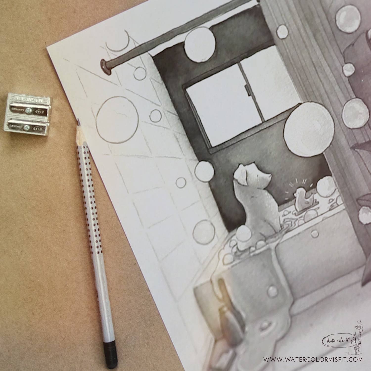
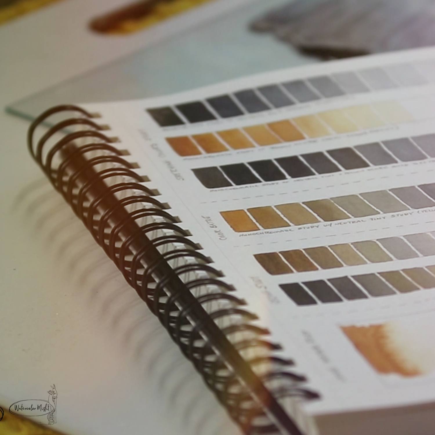
MONOCHROMATIC refers to a color scheme that is made up of one color in a variety of values and even tones of that same color. As an example – if you add white to red – you will get a variety of pinks. If you add black to red – you will get a variety of darker versions of red. In watercolor – we usually don’t use white or black when painting – but rather take one color and dilute it with water. This creates a variety of values of that same color. However, that being said, you can also add a neutral tint to a color, and create a variety of colors starting from a vibrant color to a very muddy brown. This also is considered a monotone study – since it is taking one color and breaking it down into many tones.
DOING LESS TO ACCOMPLISH MORE…
So why study Monochromatic? Sometimes you need to do less in order to accomplish more… That’s kind of what my break from YouTube has been about for me. It’s been learning to take a step back, cherish the little things, not get so sucked into the rush of life.
I’ve also been taking some time to understand why I feel in love with watercolor in the first place.
Secrets to a Successful…Monochromatic Study
That’s why I feel like it’s so fitting for me to talk about Monochromatic Studies this week. Basically, by removing the element of color – you really have to break down your overall concept and approach to painting. So here’s what learned by doing my own study…
1. YOU HAVE TO STRETCH YOUR PAPER…
- Personally, I’ve found that the monochromatic paintings that really speak to me – are ones that fill an entire page. However, that being said – this means we are going to have to stretch our paper in order to paint on a smooth “un-warpable” surface.
- CLICK HERE TO LEARN HOW TO STRETCH YOUR WATERCOLOR PAPER
2. YOU HAVE TO CHOOSE A GOOD OVERALL CONCEPT/COMPOSITION…
- This means choosing an illustration that can have a wide range of lights to darks. Thus choosing a composition with a great light source is key. This will lead to dramatic lighting – which will pop your illustration off of the paper.
- All, as stated earlier, choose a drawing that fills the entire page. These types of compositions lead themselves well to monochromatic studies and almost seem to pop off the page at you.
3. STUDY YOUR PAINTS’ STRENGTHS & WEAKNESSES…
- First – you want something that has a wide range of lights and darks – something usually that is more opaque. These types of paints – usually allow you to go very dark to nearly transparent with watercolor.
- Next – Remember watercolor is built on glazing – or layering. Some colors layer really well – whereas others not so much. So best to test it before you try it.
- Third – test to see how your color works with water. Some colors will sink into the page – while others will surf. This can be important – Depending on if you desire a loose wet look or a super controlled look for your painting.
- Finally – choose a color that works well with your composition. I choose a warm gray tone – to feel inviting and slightly cozy to the viewer. But keep in mind – some colors communicate cooler more series vibes – whereas others feel more inviting. So choosing your color wisely is also key!
- CLICK HERE TO LEARN ABOUT MY FAVORITE PAINT COLORS AND PAINT BRANDS


No Comments