
“What paint colors do you recommend?”
If you’ve been around my YouTube channel or Instagram for a while, you already know: I love talking about watercolor supplies. And one question I get over and over is, “What paint colors do you recommend?”
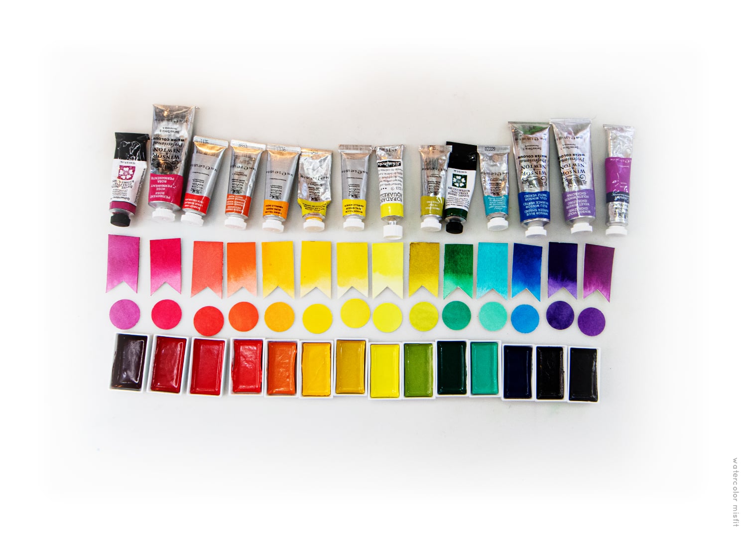
Honestly… it’s always been a tricky one for me to answer. I adore my entire paint palette. I’ve used the same core palette for nearly eight years, and limiting it down to just 12 colors is incredibly difficult for me. But in this post, I’m doing exactly that—just for you!
I’m also including some affordable, student-grade watercolor options that match my professional colors surprisingly well. If you’re building your first palette or looking to expand on a budget, you’ll find lots of helpful comparisons below.
How I Chose My 14 Favorite Watercolor Colors
If you want to know exactly why these colors made my final list, be sure to watch my YouTube video where I walk through:
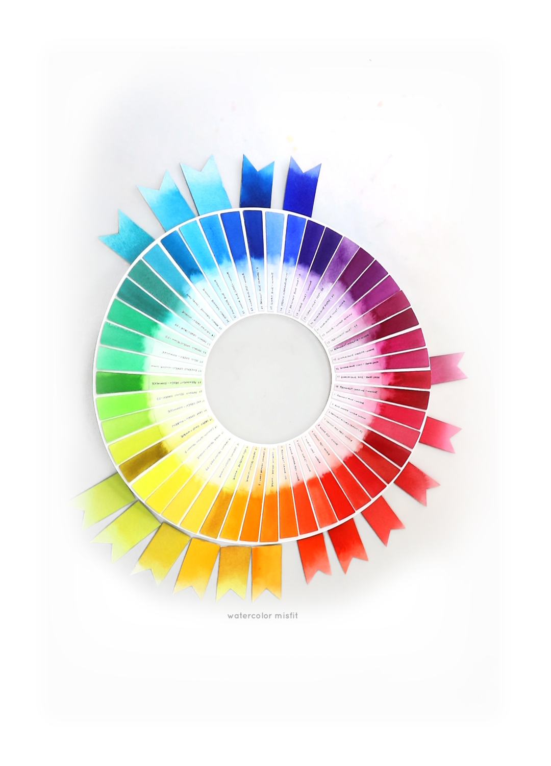
- The color wheel
- Split primary theory and
- How I built a palette that mixes beautifully with minimal mud.
(Play video here – embed your video)
A quick note:
In the video, you’ll notice I didn’t include Permanent Rose. That’s because I can mix a very close version using Winsor Orange and Quinacridone Lilac. I added it here only so I could show you a great student-grade match for that shade. So technically, my “true” palette still sits at 13 colors—but you’ll hear me explain in the video how you can get it down even further if you want a super-minimal setup.
The main goal for this palette – a palette that keeps painting and color mixing simple, intuitive, and enjoyable.
My Recommended Student-Grade Watercolors
For years, my top recommendation for beginners has been the Winsor & Newton Cotman line. These were the first paints I used back in high school, and I still know them like the back of my hand. They’re reliable, easy to learn with, and beautifully formulated for student-grade paints.
Fun fact: I still use Cotman Mauve in my current limited palette—it’s that good.
A New Favorite: Kuretake Gansai Tambi Watercolors
Over the last few years, I’ve also fallen in love with a second student-grade option:
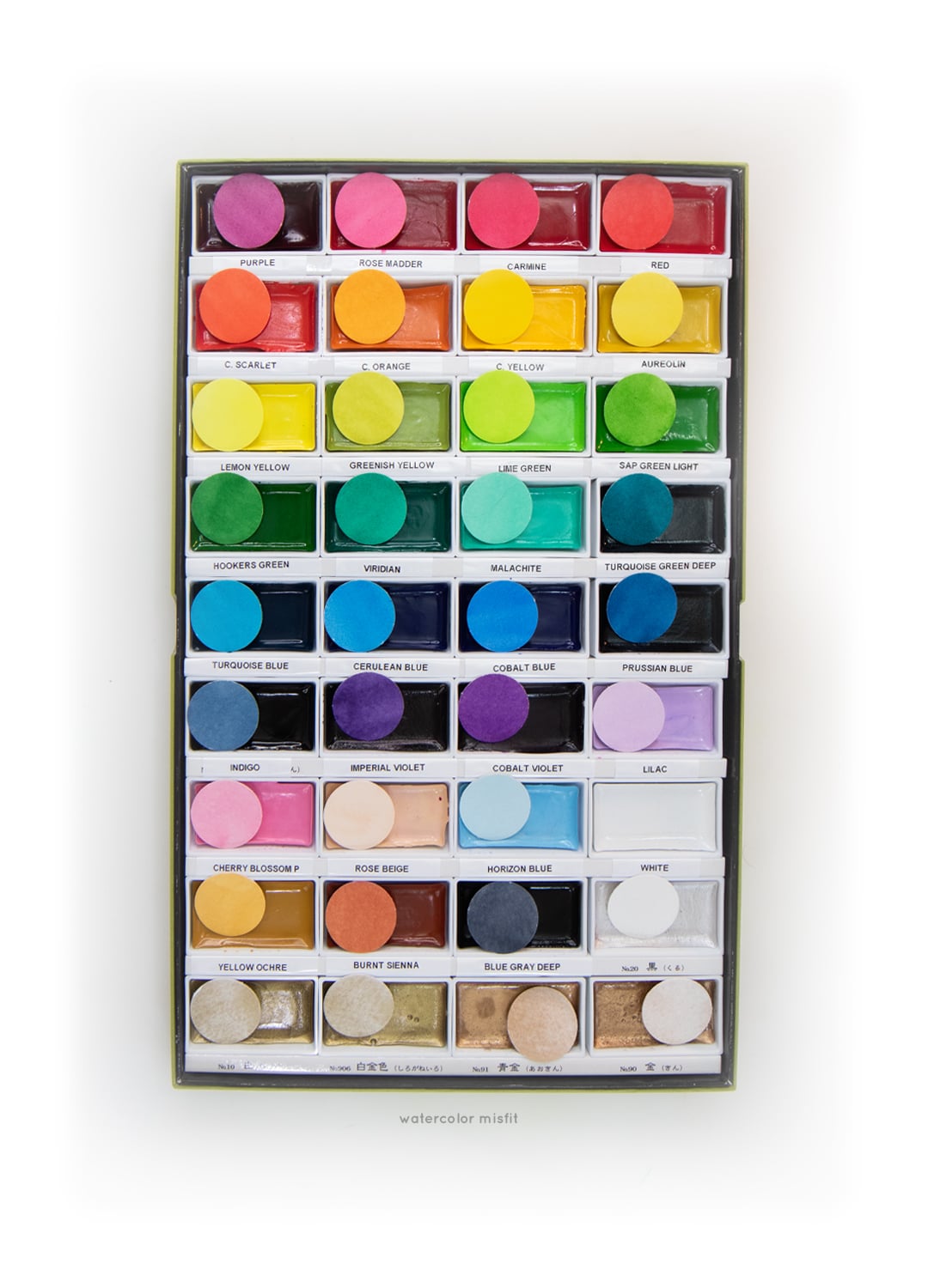
Kuretake Gansai Tambi watercolors.
I’ve purchased both the small and large sets, and honestly, I’m amazed at how closely many of the colors match my professional palette. A few shades are slightly different, but they still mix and layer beautifully—not only within the set, but also with other watercolor brands.
After around three years of using them, these have become a budget-friendly favorite I feel confident recommending.
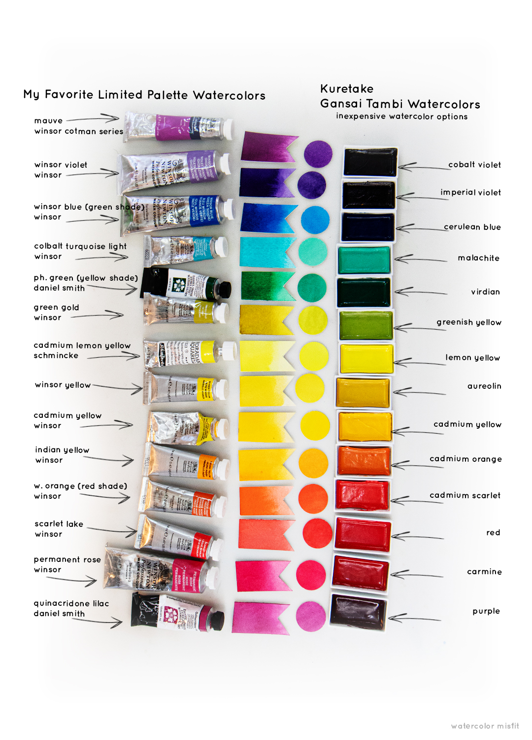
Side-By-Side Color Comparison
Below you’ll see:
- my limited professional palette,
- and right next to it the small comparison dots showing the closest matching colors from the Gansai Tambi set.
This gives you an easy visual reference if you’re looking to build a similar palette at a lower cost.
Where to Buy These Colors
- Full Sets: On Amazon, the complete Gansai Tambi sets are usually the most affordable.
- Individual Colors: If you’d rather test a few shades first, you can also buy individual pans from the retailer I linked in this post. Most run $2–$3 each (current at the time of writing).
This makes it easy to build your palette slowly—or customize it based on the colors you naturally gravitate toward.
One Important Note: Transparency vs. Chalkiness
The Gansai Tambi paints have beautiful color payoff and are incredibly vibrant. However, they do have a slightly chalkier finish compared to traditional transparent watercolors.
If you love that soft, luminous transparency watercolor is famous for, these might not be your top choice.
But if you enjoy bold, bright, expressive color—or you just want an affordable way to start experimenting—this line is a fantastic option for beginners and seasoned artists alike.
Final Thoughts
Whether you’re building your very first watercolor palette or refining a set you’ve used for years, choosing colors should feel exciting—not overwhelming. These limited palettes (along with the budget-friendly alternatives) give you everything you need for:
- easy color mixing
- predictable results
- tons of creative freedom
If you want to dive deeper, don’t forget to check out the full YouTube breakdown. And feel free to leave a comment telling me what colors are must-haves in your own palette—I love seeing the combinations other artists use!


2 Comments
Joelle
December 26, 2025 at 1:14 pmI’m wondering what about the Kuretake paints indicates to you that they are student grade? The Blick website lists them as Professional:
Kuretake Gansai Tambi Watercolor Paint Pans and Sets
-Professional-grade Japanese watercolor pans
-Smooth, creamy, and semi-opaque
-Responsive and quick activating
-Large pans accommodate broader brushes
Carrie Luc
February 14, 2026 at 8:55 amYou are right – they are considered professional paints – but they are in a price range similar to student grade paints. Making these a much more affordable option for those beginning in watercolor.