THE PROBLEM OF LIGHTFASTNESS…
Watercolor concentrates tend to be a pretty device supply when it comes to artists. The reason is because most are not lightfast… But what is lightfastness? And why is it so divisive among artist?
To put things simply – Lightfastness refers to the permanence of a paint color when exposed to light over time. The better the lightfastness of a color – the longer that color will remain pure and bold on your paper with little fading. Some colors have been known to have a lightfastness that can last for over 50 years without fading. These colors are considered excellent in quality. Meanwhile, over colors may only keep their vibrancy for a couple of months or years. Which is where the debate begins…
PERMANENCE & THE DIGITAL AGE…
Ages ago – artists coveted paint colors that could stand the test of time – Their aim was to have museum quality pieces that would keep their colors from generation to generation. Some artists today still seek museum quality paints – or paints that they know will remain colorful and unchanging when sold to their new owner.
But with the dawn of the digital age – came a new desire of vibrant paints that didn’t necessarily have to stand the test of time. Instead the artist could create digital prints of their art work – creating either multiple prints of one painting or using those illustrations for social media purposes or even magazines and other printable items.
THE PROS & CONS OF CONCENTRATES …
PERMANENCE & THICKNESS
So the first question you need to ask yourself is what do you plan to use your painting for? Do you want permanence? If so – PH. MARTIN’s has a line of watercolor concentrates called HYDRUS. These concentrates ARE LIGHTFAST – but personally I don’t really care for them. If given the choice to work with HYDRUS or my regular tube paints – I prefer my regular watercolors. This is more of a personal preference – but basically the HYDRUS watercolors have a thicker consistency than I like when painting with concentrates. They just don’t have that transparent glow that appearance more like ink on the page.
DYE VS. PIGMENT
No, if you don’t really care about the permanence of your colors – suddenly a whole new world has opened to your finger tips. Once again – PH. MARTIN’S has another line called the RADIANT line. These watercolor concentrates are NOT LIGHTFAST – but appear completely transparent in the bottle as well as on the paper. They are incredible great to work with in wet on wet techniques and act more like fluid ink on the page. Another brand of watercolor concentrates that is also NOT LIGHTFAST is ECOLINE which also has a wide variety of transparent colors that act more like ink and dance across the page. But keep in mind – that if you want to mix these concentrates with other paints – you should do a pre-test swatch before committing while painting. Since concentrates are made with dyes – they can do some weird things when mixed with pigment paints (such as tube based or pan based watercolors). So it’s best to just play around and see what happens.

STORAGE
The last thing to keep in mind when using watercolor concentrates is storage. Since these paints aren’t lightfast – and can fade within a couple of months if place in direct sunlight – it’s best to keep your paintings stored in a dark location – such as a black folder or portfolio away form sunlight. After finishing a painting – I always take a couple of high quality photos and store them on my computer for future use. These can be turned into art prints or just used for digital purposes as I stated earlier.
WHY USE CONCENTRATES …
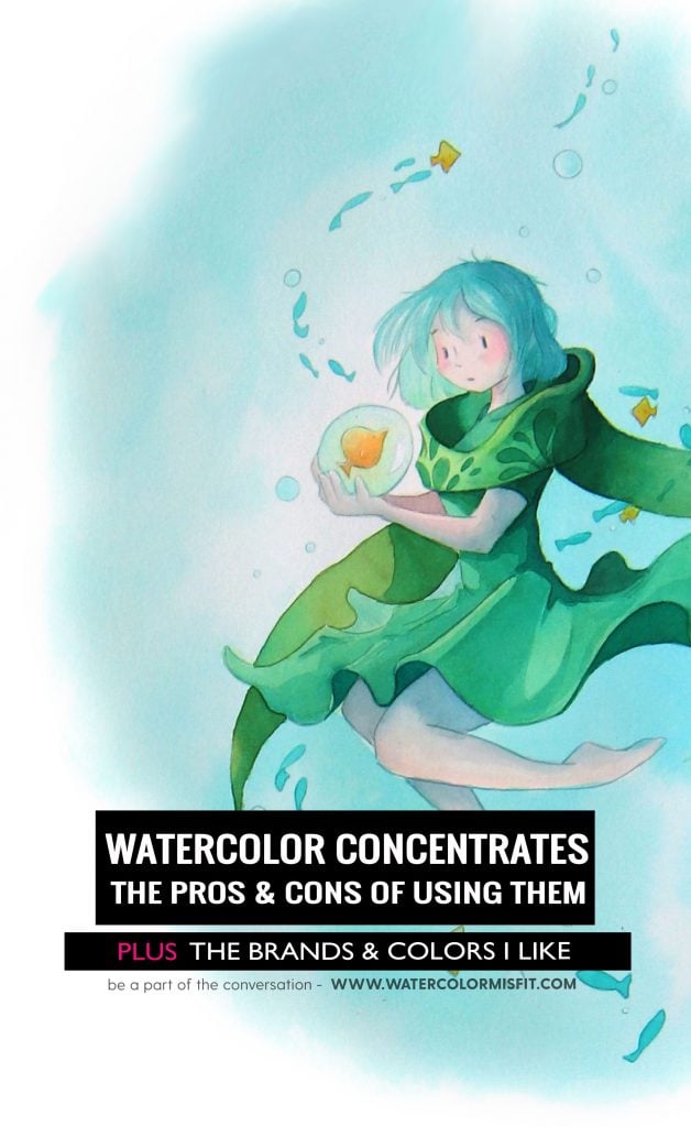
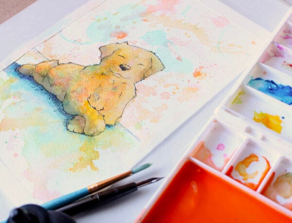
So now that I’ve given you a pretty good idea of the pros and cons of using watercolor concentrates – WHY USE THEM? Well, for me, I LOVE the look of these paints on the paper. They are vibrant and incredible smooth in texture. They also give a light and airy feel that can’t be achieved with pigment paints. As seen in the illustration below. I receive so many complements on this particular illustration and many can’t believe it’s a painting. Rather they think it’s a digital painting done in photoshop. But I assure you it’s a painting on a piece of hot press watercolor paper. The reason I’m able to capture such light and airy colors in this painting is because of the watercolor concentrates. I never could have capture this painting with pigment paints alone. Rather, I used a mixture of watercolor concentrates and my trust worthy tube paints to give this airy and serene color scape.

So that’s a short synopsis of watercolor concentrates and my thoughts on using them. If you are curious as to the concentrates I use – make sure to check out the list below ?
MY CONCENTRATES SUPPLY LIST
PH MARTIN’S CONCENTRATES RADIANT LINE
Below is a list of the colors I like from the PH Martin’s line. I haven’t included all my paints – since I own all three sets – but these are the colors I find myself going to most and repurchasing most ? You can purchase these individually from DickBlick Art Supply Store (CLICK HERE).
- TANGERINE – SET B
- ORANGE – SET A
- TIGER YELLOW – SET D
- LEMON YELLOW – SET A
- TAPESTRY – SET C
- CHARTREUSE – SET C
- JUNGLE GREEN – SET C
- TURQUOISE BLUE – SET A
- CYCLAMEN – SET B
ECOLINE WATERCOLOR CONCENTRATES
These are a fairly new line of concentrates I’ve begun to play around with. So far – when comparing PH MARTIN’s Line to these – I’d have to say I like these better just based on feel of the paint. Below is a list of the colors I’m currently playing around with.


No Comments