

Let’s face it – there are so many watercolor paper brands out there that it can get really overwhelming trying to choose the right one for you. So today I’m doing something I honestly wish I’d done years ago, if I’d had the money to do so: a battle royale for watercolor paper brands.
The Plan
I have 10 watercolor paper brands – some I’ve gathered over the past year, and some I ordered based on your suggestions. I bought all of these brands with my own money. To keep the playing field as even as possible, I bought only 140lb cold press watercolor paper and cut each sheet down to the same size, so they’d all look nearly identical.
Once I started painting, I realized there were more things I wanted to test than could fit in one video, so I split this into three rounds. Each round pairs the papers off against each other and pits them on a specific set of objectives – this post covers round one.
What I Judged Each Paper On
Watercolor supplies are very much a personal preference, so these are the objectives I care about – yours might be different. Here’s what I looked for in each paper:
- WARPING/BUCKLING: Did the paper remain flat during the entire painting?
- PAINT ABSORPTION: Did the paint absorb evenly into the paper?
- COLOR VIBRANCY: Does the color look vibrant – especially in the final illustration?
- SMOOTH WASHES: Does the illustration have unwanted textures?
- WET ON WET: Did the paper work well using heavy amounts of water?
- GLAZING: Does the paper layer well over previous colors?
- OVERWORKED: Does the paper rip or peel when overworked with water?
- CORRECTION: Is it easy to lift or correct mistakes?
- OVERALL FEEL: Was the paper easy to paint on as a whole?
For round one specifically, I paired two brands against each other at a time and picked a winner based on paint absorption, color vibrancy, smooth washes, correction, and overall feel. These round one illustrations didn’t call for a lot of water, which is why warping, wet-on-wet, glazing, and overworking become bigger factors in later rounds.
Round 1 Results: Who Won Each Battle
To keep this as unbiased as possible, I painted each matchup with the brand names hidden from myself, and I kept the names hidden from you, too, until each winner was declared. Here’s how round one played out.
Canson XL vs. Strathmore: Canson XL won this one, though I’ll be honest – it wasn’t the easiest paper to work with.
Saunders Waterford vs. Grumbacher: This was a no-brainer. Saunders won hands down – a very easy choice.
Fabriano Artistico: A very close battle, but Fabriano ultimately won for me because of its smooth textures – that’s just a personal style preference of mine.
Watercolor Bee Paper vs. Winsor & Newton: Another close one, but Bee Paper won out for me on ease of painting, vibrancy, and smooth washes.
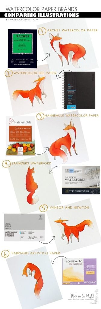
Arches vs. Hahnemuhle Cezanne: Arches is a tried-and-true brand, while Hahnemuhle is newer to me – I only discovered it a couple of years before filming this. Out of every pairing in round one, this was the closest. I had such a hard time choosing that I asked my husband to help. Looking at both papers up close, we both felt the one on the left was a little more vibrant and a little smoother – and that turned out to be Hahnemuhle. It was a genuine shocker for me.

There was still one open slot in round two – a chance for one of the losing papers to come back for a second chance. I opened that pick up to a viewer vote at the time, so which paper claimed that last spot depended on the poll results from the original video.
Another Look at the Brands Side by Side
Where to Find Each Paper
ARCHES WATERCOLOR PAPER
WATERCOLOR BEE PAPER
HAHNEMUHLE CEZANNE PAPER
SAUNDERS WATERFORD PAPER
WINSOR AND NEWTON
FABRIANO ARTISTICO PAPER
And if you want to learn how to paint foxes the way I did in this video, I also have a Fox Course for beginners – buying a course is one of the ways you help support this channel and future videos.